Design in casual dining

Published on host.Milano on 27th November 2015:

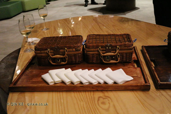
Picnic basket

Last month I attended San Sebastian Gastronomika, an annual food conference with a focus on fine dining, ingredients and wine. Each year, the organisers focus on a different theme and this year it was the joint cities of Singapore and Hong Kong.

I had hoped that the conference would give me some insights into the food scene in Singapore and Hong Kong as both are destinations I have yet to visit. Instead however, I got thinking about design.

Let me explain.

Each day, several of the world’s best chefs, both from Spain, where the conference is hosted, and from the guest cities, demonstrate dishes or ideas from their restaurant. To accompany their presentations, the chefs also prepared a little tasting sample for the audience. In most cases, the chefs had fine dining restaurants but for the purpose of the tasting sample, all of the plates, bowls and containers were plastic. So the question is, how to elevate the food even if it’s served in plastic containers?

Luckily for the chefs, there were options besides the straight-up box containers. In fact, the containers were in a myriad of shapes that were designed to mimic fine dining plating. For example, one platter was shaped like an oyster and was perfect for holding a small sample of pickled vegetables. It was something that added to the overall aesthetic of the dish and propelled it from being just something ordinary.

But what does this mean for casual dining? Well the answer is perhaps most applicable to street food vendors where containers are inevitably single use.

What if, by simply using a different shaped container, you could make your casual offering a much more marketable product? What if that product could then be sold for a higher price? It could be the difference between a road-side business and a potentially more lucrative events business.

Yes, no doubt, fancy plating costs more but sometimes it’s as much about the presentation as it is about the food.
The philosophy of restaurant design

Published on host. Milano. on 17th April 2015:

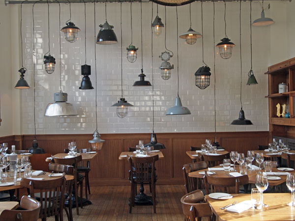
The Corner Room

In London, restaurant design is surprisingly powerful in its subtlety.

Think, for example, of a restaurant with stripped back lighting, bare walls, white tiles and chrome fixtures. Who do you imagine will dine in such a restaurant? And what kind of food will be served? Now, what about a restaurant with plush banquettes, aged-wood panelling and framed paintings? Has your diner aged by a couple of decades?

As in other parts of the western world, a well designed restaurant in London might get mentions in a magazine, gain kudos in awards or even attract the right type of clientèle. Followers of restaurant psychology might even argue that the right restaurant design can increase the average spend of the diner, making restaurant design an incredibly powerful tool for the restaurateur.

Meanwhile, restaurant design in China is a wholly different ball game. Here, it’s less about the fine-tuning and more about the turnover.

Now, we’re not talking about the European restaurants in Shanghai which aspire to their international counterparts. Nor are we talking about international hotel restaurants which are inspired by a brand identity. Rather, we’re talking about restaurants for the mass market.

According to one restaurateur I spoke to last year, a successful restaurant will need to redecorate once every two or three years to maintain a sense of “newness” for its diners. A restaurant that hasn’t been redecorated for seven years or more is basically on its last legs and will have seen dwindling visitor numbers for some years.

The reason? Competition.

The number of restaurants in China is so incomprehensibly large that the only thing which distinguishes between them is that sense of newness. Here, restaurant design isn’t built to last but rather, just until its shiny edge has worn out.

Vivienne Westwood to design new Virgin Atlantic uniforms

Published on CNN on 6th May 2013:

Virgin Atlantic is trying to go punk.

The airline has announced that the latest designer to be turning her hand to their uniforms is Dame Vivienne Westwood.

The fiery British designer will be bringing her punk rock aesthetic to the signature Virgin two-piece, in a collaboration that will span the next 10 years.

The official announcement said that designer would be going for “a futuristic look, which references her enduring interest in 1940s French couture cutting techniques as well as the Savile Row tailoring heritage.”

Read more at CNN

Meet the maker: Benjamin Millett

Published in FT Weekend Magazine on 29/30th May 2010 Issue number 362:

Meet the maker

Benjamin Millett Co-creator, Kug

Product:

Kug

What it is:

A mini kettle that doubles as an insulated travel mug

In his words:

“The Kug started as a project at the National College of Art and Design in Dublin to design a product that would make life easier for people with rheumatoid arthritis. One day, at an arthritis centre, we saw some ladies pouring their tea. We realised they were having difficulty with the small cup handles, which they couldn’t grip, and with the kettle, which was too heavy.

We started looking at everything to do with making a hot drink and how we could improve the process. First of all we thought about redesigning the kettle but then we decided to combine it with the mug.

We chose not to put a handle on it because the weight is then further away from your wrist joints. If you hold a cup in your hand, the centre of gravity will be closer to your wrist, so it will appear lighter.

The Kug is like a travel mug, it’s dual-walled and it’s insulated, but it sits on a dock the way that your kettle does at home, and plugs into a socket. The lid is very similar to the lids on takeaway cups but it’s made from silicone, so it’s more durable and flexible.

We think it’s great for students as well. You can have soup in it, you can do noodles in it, you can do hot chocolate. You can do anything that requires heating water.”

www.thekug.com